Issue No. 1
How do you turn a legendary downtown bank into a workplace
without sanding off its soul?
[many lives]
The elevator is older than the subway. That’s not hyperbole.
Before this building held desks, it held deposits. Before that, immigrant ambition. Before that, decades of graffiti, photography, artists, storage drawers, Supreme lines, and downtown mythology.
190 Bowery was never designed to become a workplace in 2026. Which is exactly why it works.
The building still knows how to gather people. We felt it in the wide landings and long sightlines, in the worn oak floors and light pouring through oversized windows. The original purpose may be gone, but the energy isn’t. It was built to hold value. Now it holds a different kind.
[what we kept]
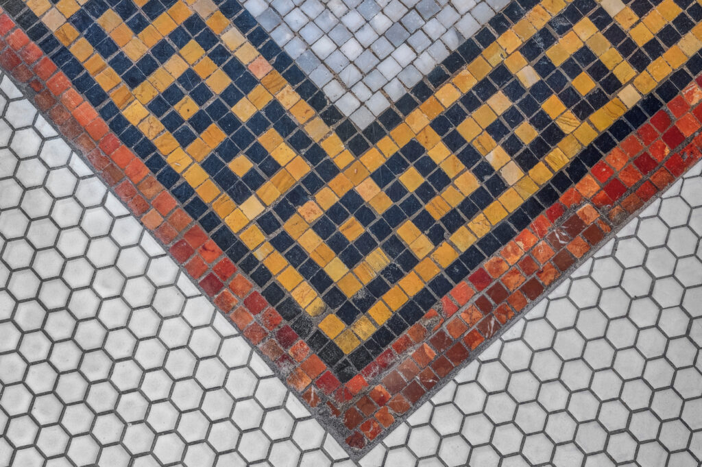
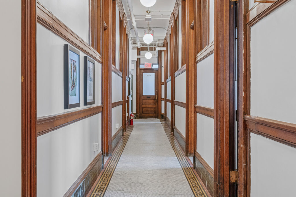
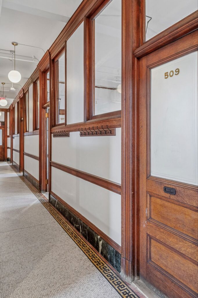
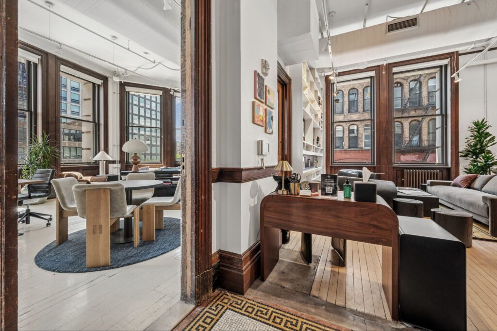
The easiest way to redesign a historical building is to erase it. But at 190 Bowery our approach was the opposite. Many of the building’s defining elements—narrow plank oak floors, mosaic tiling, original millwork, shelving, plaster, even traces of wear—were treated less as imperfections and more as evidence of a life already lived.
So we didn’t approach this as “restoration.” But more as continuity.
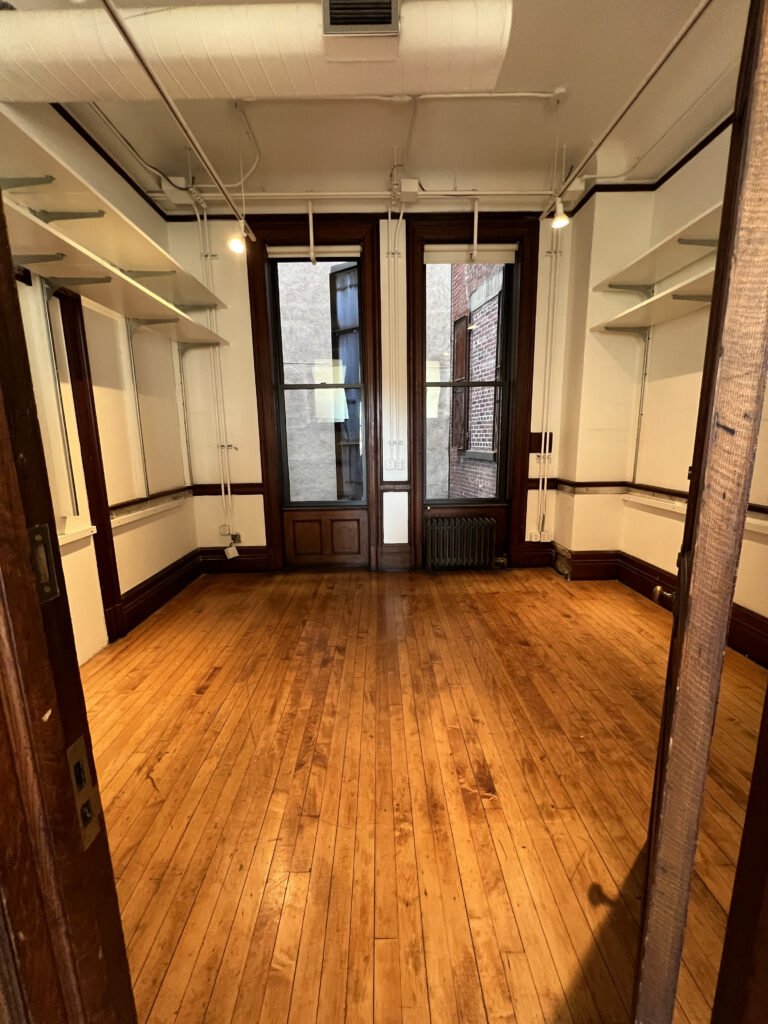
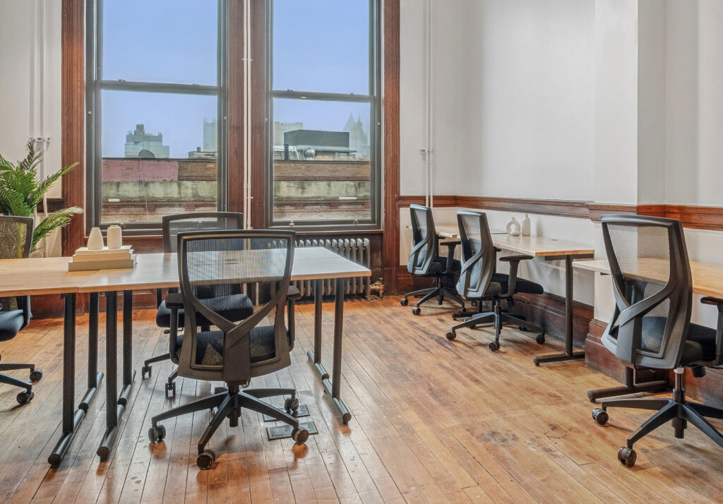 The floors were refinished, not replaced. Certain marks and irregularities are supposed to be noticed. Evidence to the decades spent as studios, storage, gathering spaces, and workrooms.
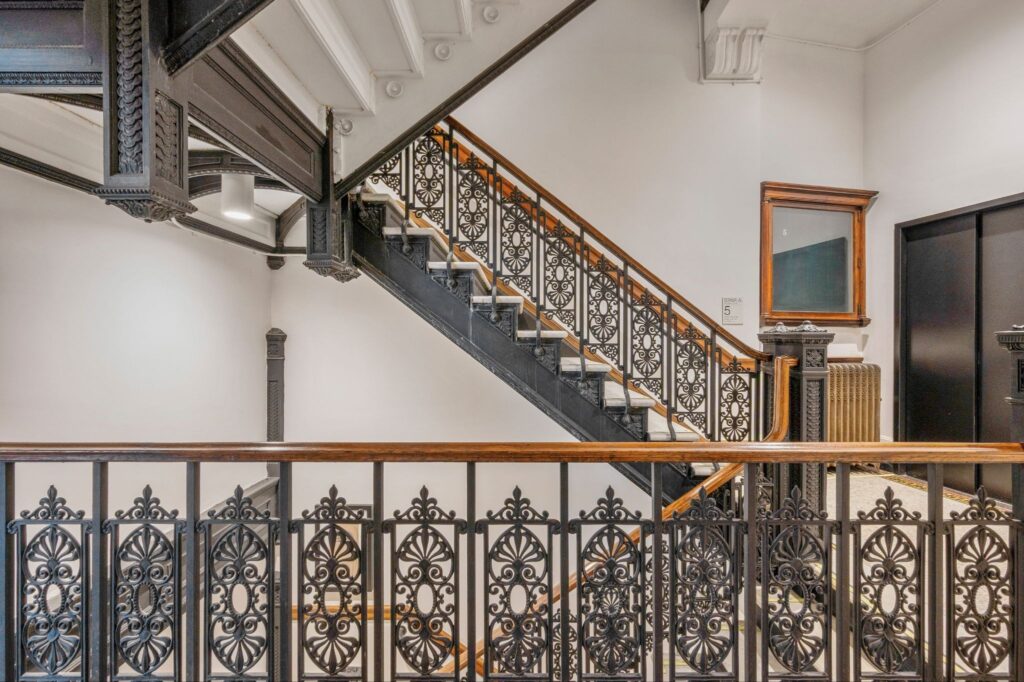
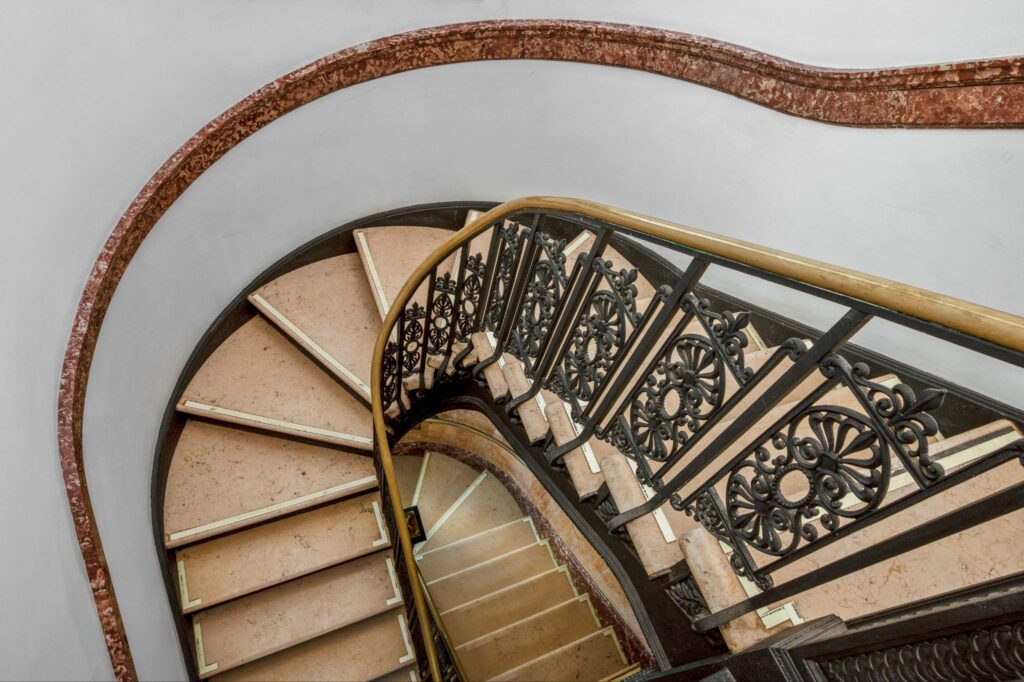 The serpentine staircase: One of the building’s architectural anchors, up through the throat of 190 Bowery. The scale of it slows movement in a way offices of today rarely do.
 Originally built to hold thousands of found objects, books, and photographic materials. Some from the Gilded Age, others from the late 20th C. Portions remain integrated into the space today.
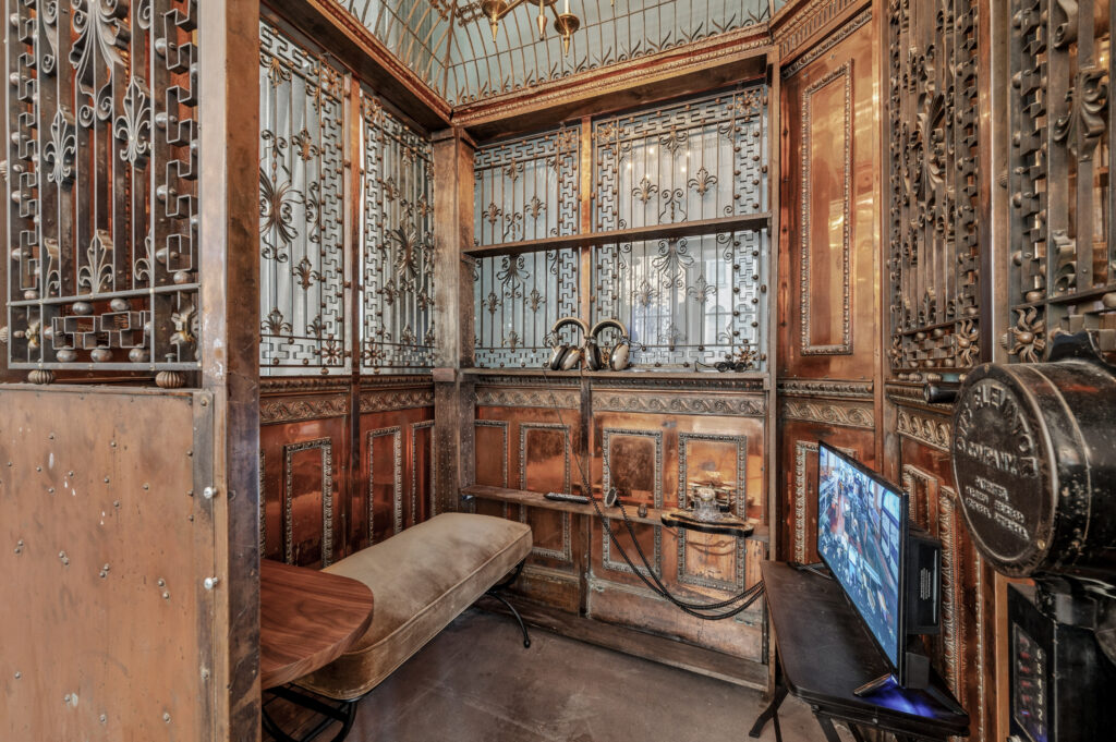 The original copper-cage elevator still survives on the second floor. It now functions less as infrastructure and more as artifact. Feel free to take a call.
 A reminder that the building predates nearly every version of modern office design, and direct inspiration for our logo
[the constraints]
190 Bowery, in a way, resists control. It resists clearer sightlines, smoother finishes, and structural predictability. So our challenge wasn’t how to redesign the building. It was how to support the way people work inside it without flattening the very qualities that made the space feel alive in the first place.
“We realized early on that over-polishing the space would be a disservice to its history.”
Jean Chandler, VP of Global Design
This building has identity: we’re not inventing one. This wasn’t made for modern office use: which brings tension. Hospitality needs to adapt to the architecture: not overpower it.
 Many of the building’s surfaces resisted standard workplace instincts toward uniformity. Rather than smoothing inconsistencies away, the design approach allowed texture and wear to be something to smile at.
 Built in 1898 as a bank, the structure predates almost every assumption modern offices make about scale, circulation, and workflow. Adapting it required flexibility from the workplace model itself.
“The temptation with historic buildings is to prove you’ve updated them,” says Jean. “But the more pristine we made certain spaces feel, the less honest the building became.”
Instead of treating the original architecture as a backdrop, the design process treated it as a collaborator. Existing millwork, oak flooring, plaster, shelving, and even moments of visual friction became part of the workplace experience itself.
Some buildings need redesigning.
Others just need room to keep being themselves.
[material studies]
The material palette, as you can imagine, was built through contrast. Think aged oak against brushed steel. Or ornamental metal work next to a bushy rug. All in the frame of an oversized window. The goal wasn’t to polish it, just balance it.
 Oak flooring. Original narrow-plank oak remains throughout much of the building, carrying visible wear from decades of use.
 Frosted glass. Softens the building’s harder architectural edges without fully obscuring them.
 Weathered metalwork. Certain finishes were intentionally left imperfect. Patina became part of the atmosphere rather than something to remove.
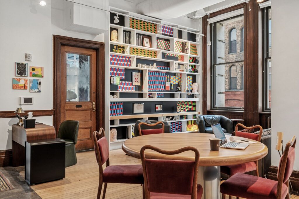 Much of the furniture was selected for its “material honesty”—pieces substantial enough to stand alongside the building’s architecture without mimicking it.
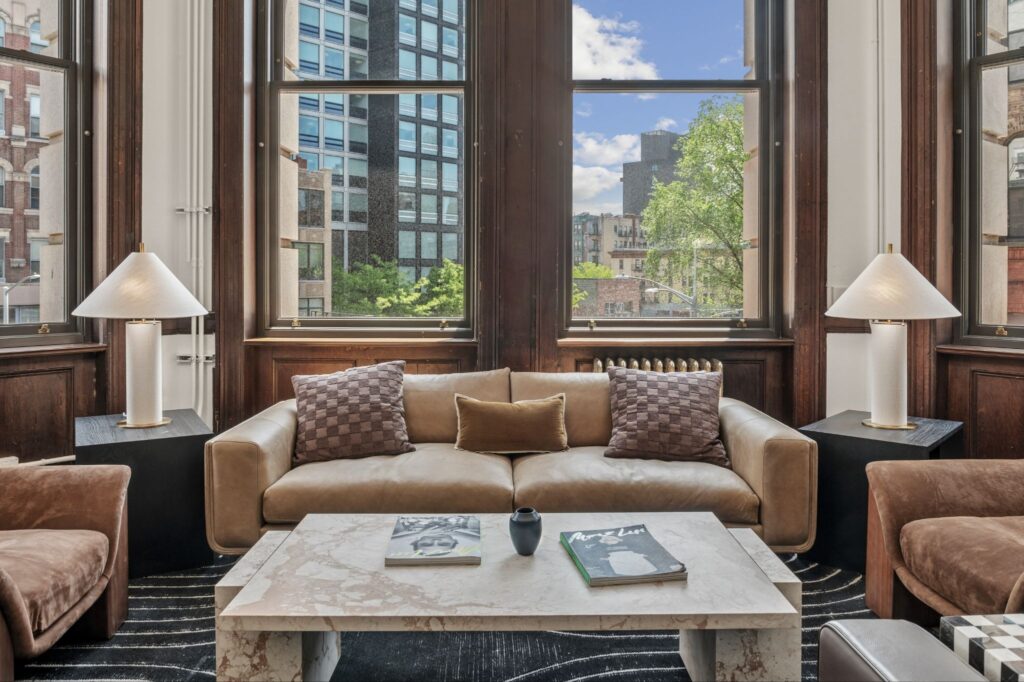 Softness as counterbalance. Rugs, upholstery, and ambient lighting temper the scale and hardness of the original structure.
Pairing Notes:
| Original | Introduced |
| Mosaic tile | Layered Rugs |
| Ornamental ironwork | Ambient lighting |
| Aged oak | Upholstered seating |
| Plaster walls | Original artwork |
“Their furniture doesn’t act like furniture”
-Jean Chandler, vp of Global design on uhuru
[why it works]
A good workplace supports focus but we think a great one shapes rhythm.
At 190 Bowery, many of the building’s strongest qualities weren’t introduced during the redesign; they were already embedded in the architecture. Natural light, generous ceiling heights, slower circulation paths, softer gathering spaces, and layers of visual texture all subtly influence how people move through the workday.
It’s all here from its Gilded Age roots; our task was to recontextualize it.
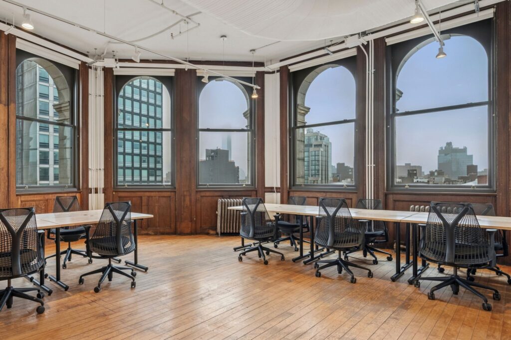 Natural light reaches almost everywhere. Because of the building’s shallow floor plates and oversized windows, daylight remains present across much of the workspace throughout the day. The result is less visual fatigue and fewer spaces that feel hidden away from the rest of the building.
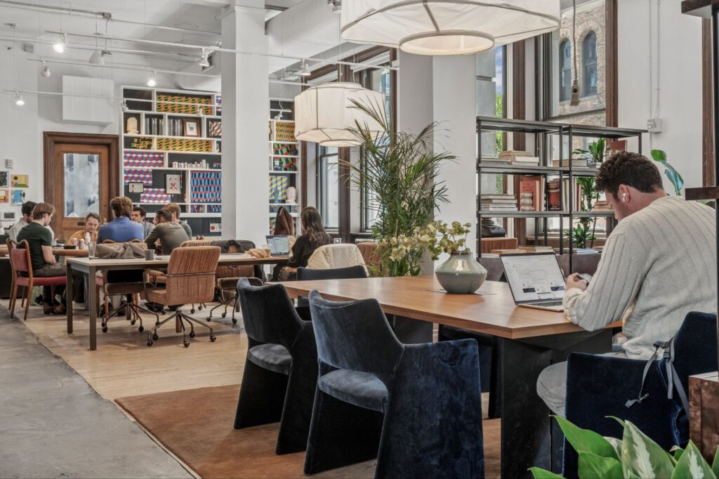 The space encourages lingering. Soft seating, layered lighting, and residential-scale furniture create areas where conversations can extend naturally instead of feeling purely transactional.
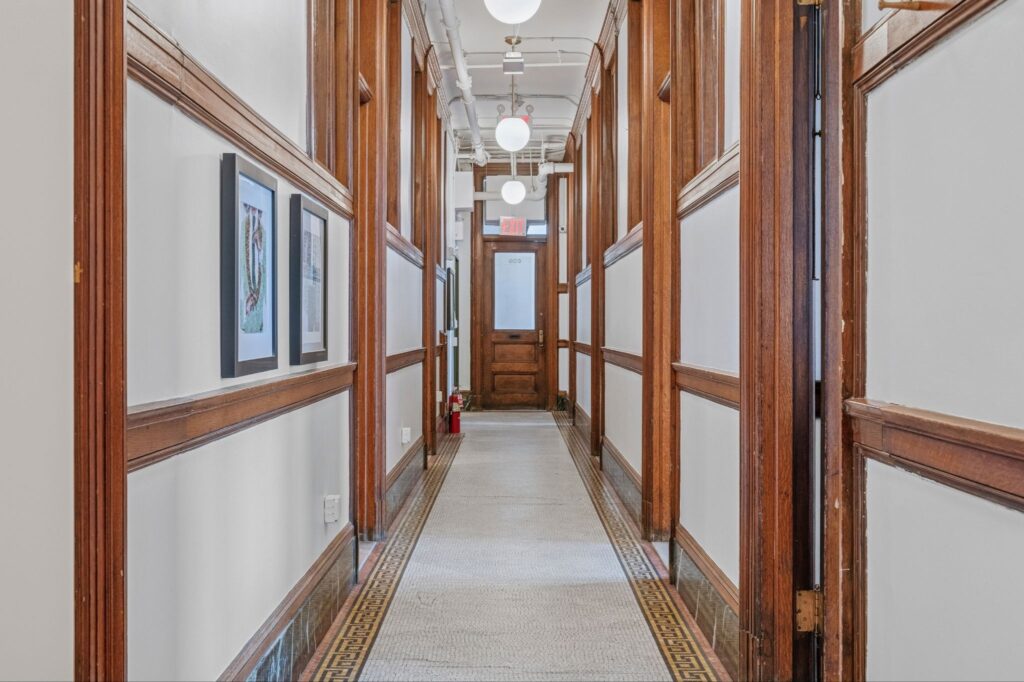 Movement slows down here. The building’s original circulation patterns create moments of pause uncommon in contemporary office design. Wide landings, stair transitions, and visual depth make movement through the building feel less compressed.
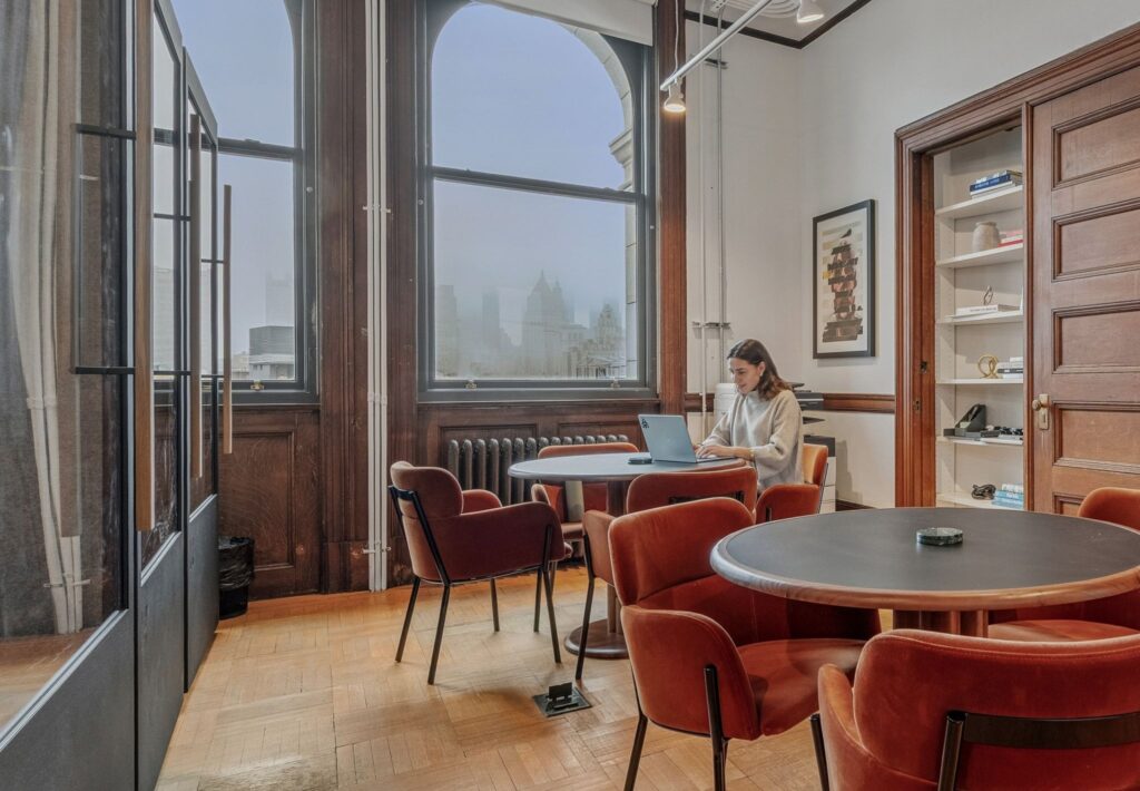 Privacy exists without isolation. Smaller moments throughout the building allow people to step away without feeling completely disconnected from the larger energy of the space.
Much of modern office design prioritizes efficiency above all else: cleaner circulation, fewer interruptions, get there ASAP.
“Our design riffs on the existing character rather than trying to overwrite it.”
-Jean Chandler, VP of Global Design
190 Bowery works differently. The building introduces a small amount of friction back into the workday—texture to notice, staircases to move through, rooms that reveal themselves gradually instead of immediately. No two areas of the building resolve exactly the same way.
In practice, that subtle complexity makes the workplace feel more human. Less optimized for throughout. More supportive of presence. In that regard, you don’t have to adapt to the building like most workplaces do; 190 Bowery asks that you settle into it instead.
[one thing you’d miss]
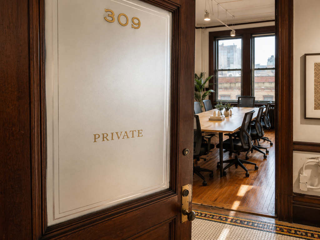
The numbering on the Private Office doors wasn’t newly sourced for the space.
It references the original typography once used throughout the Bank’s teller booths more than a century ago, matching both the font and placement.
At 190 Bowery, some of the most meaningful design decisions aren’t the loudest ones. They exist to create continuity between the building’s past and present without turning history into a spectacle.
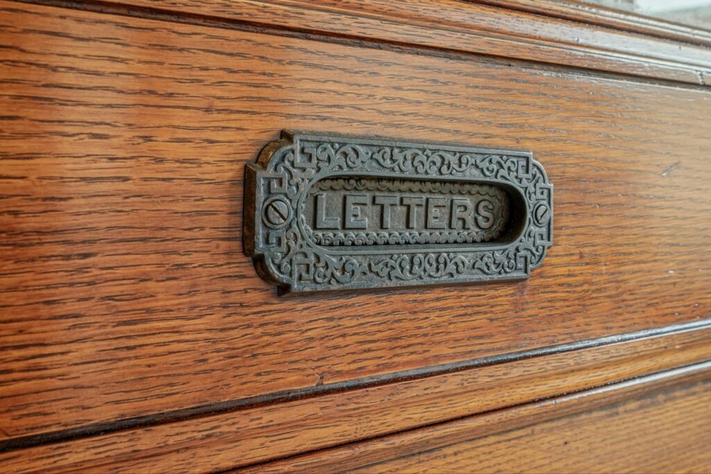 Letterdrop
[one thing we refused to change]
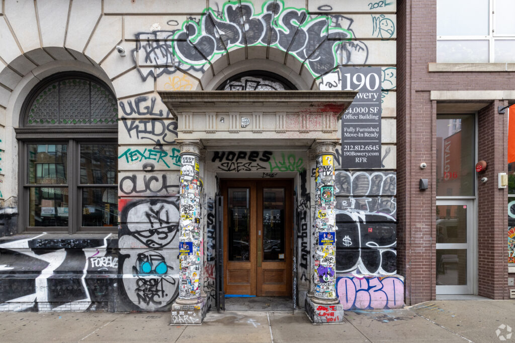 Exterior shot; graffiti layers against the stone
Over the decades the exterior of 190 Bowery became one of Nolita’s most written-on surfaces. Keith Haring was even known to practice his chalk babies on its facade.
Tags layered over stone. Names on names. Fragments of different artists accumulating slowly across the face while the building sat largely sealed off from the city around it.
During our redesign, not every trace was erased. That decision was intentional.
The graffiti had become part of the building’s visual memory—evidence of vacancy, reinvention, downtown culture, and the generations of people who moved around Bowery and Spring long before this space became a workplace again.
At 190 Bowery, “preservation” isn’t about power-washing away irregularities or trying to hide time. It’s about honesty, and realizing some buildings become more believable once they stop trying to look untouched.
“Over-polishing the space would have been a disservice to its history.” – Jean Chandler
[how hospitality shapes the layout]
At Industrious, hospitality isn’t layered onto the workplace afterward. It shapes the workplace from the beginning.
At 190 Bowery, that meant thinking beyond desks and offices toward rhythms: how people arrives, gather, transition between spaces, take calls, pause, host clients, or spend an entire day inside the building without feeling compressed by it.
 Arrival was treated as transition, not a checkpoint. The entry from the street, to the stairs, to the workspaces slows the shift rather than forces it.
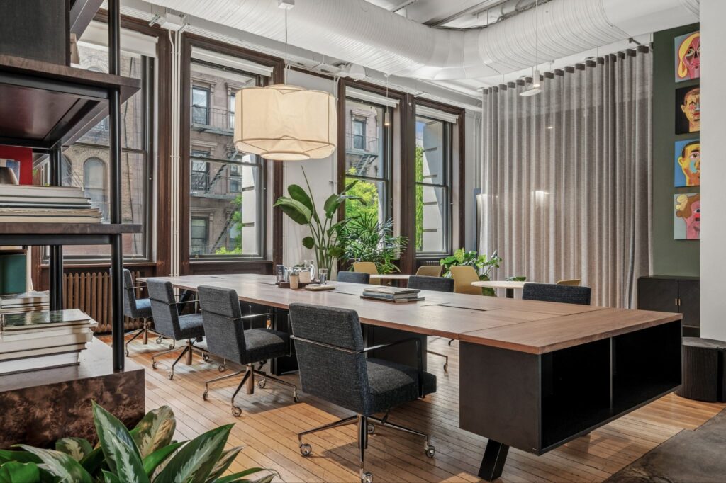 The Parlor. Part workspace, part lounge, part gathering space. The Parlor was designing around a different kind of workday—one that’s configurable to your needs and rhythm day to day. Teams can spread out, regroup, take calls, work independently, or spend an entire afternoon in the same shared environment without needing to relocate every hour. The goal wasn’t to recreate a traditional meeting room. It was to create a space people would actually want to stay in.
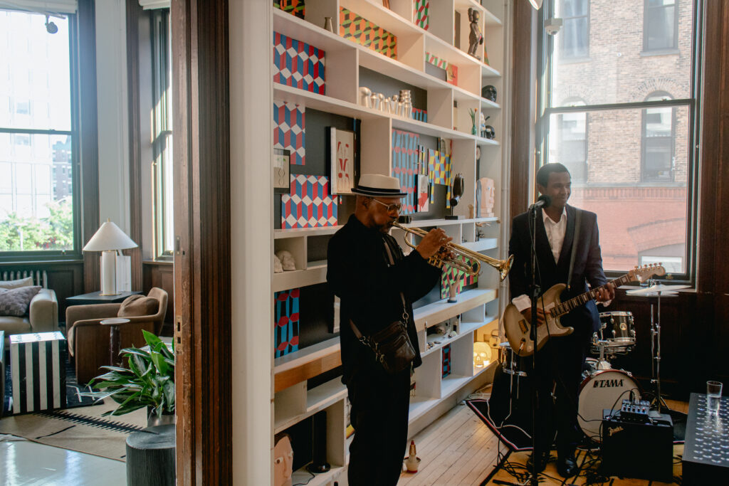 Solomon Hicks performing
Lighting, seating, music, and circulation shift subtly from morning workspace to evening atmosphere without needing the environment to fully reset itself. This lets 190 Bowery convert in-character for events, after-hours, and private gatherings.
Hospitality often shows up in small spatial decisions long before service enters the picture.
[still thinking about…]
A building designed in 1898 should not logically function as a workplace in 2026.
And yet much of what people want from work now—warmth, texture, flexibility, natural gathering spaces, character, a sense of place—already existed here long before modern office design tried to invent it.
190 Bowery didn’t need a new identity.
It just needed another chapter.
[TIMELINE]
- 1899: Germania Bank erected
- 1966: Jay Maisel purchases the building
- 1966–68: Lichtenstein + Gottlieb studios
- 2015: Jay sells 190 Bowery
- 2019: Supreme opens ground floor retail
- 2025: Industrious signs lease